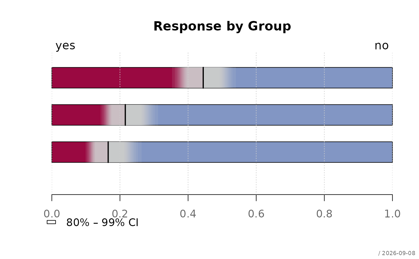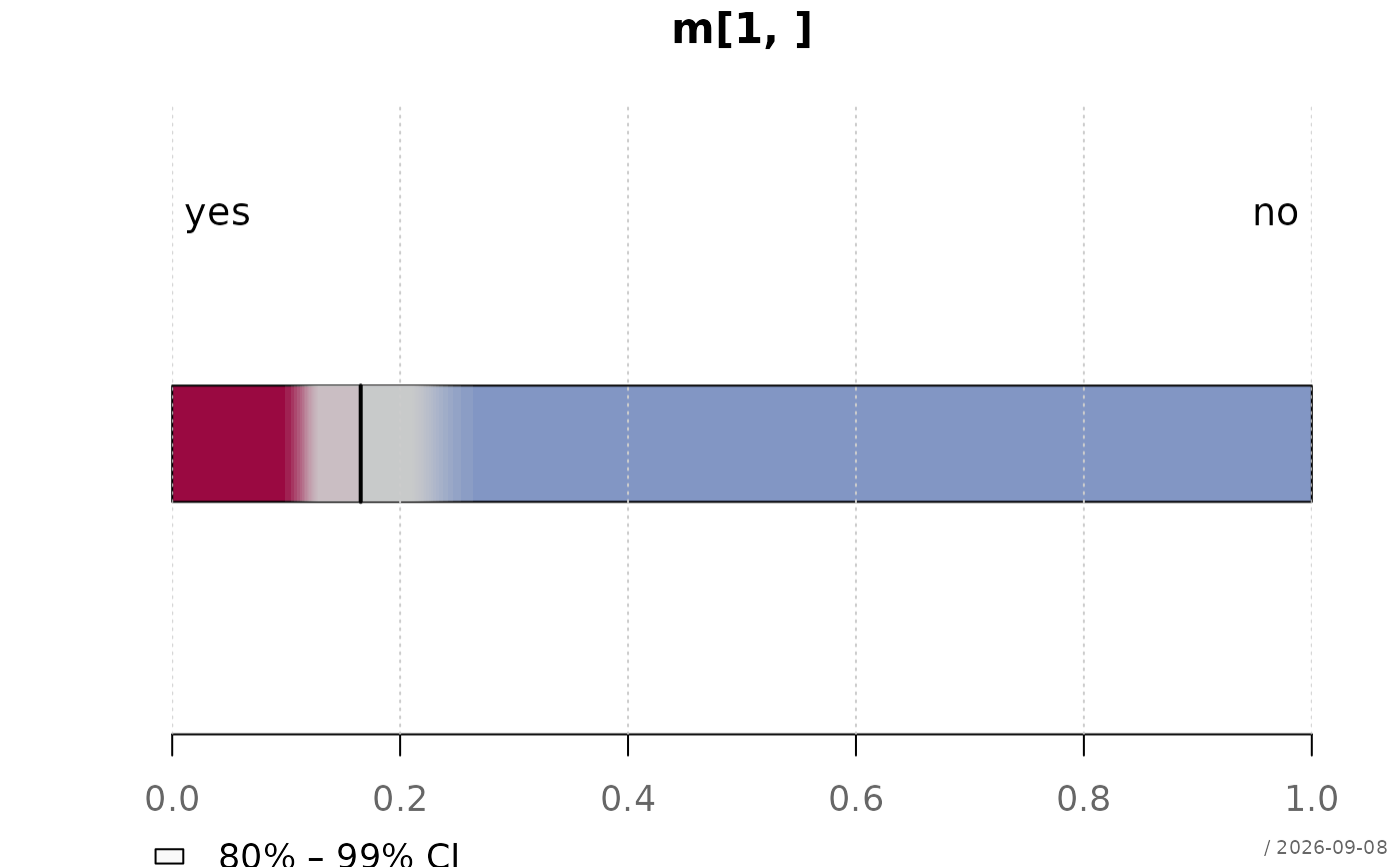
Displays a horizontal bar with nested confidence interval bands from
min(ciLevels) to max(ciLevels) to visualise the uncertainty
of a proportion. Bands are drawn in a semi-transparent grey so that the
accumulated overlap creates a natural density gradient - darker in the
centre, lighter at the edges.
Usage
plotPropCI(
  x,
  main = NULL,
  xlab = "",
  xlim = c(0, 1),
  ciLevels = seq(0.99, 0.8, by = -0.01),
  col = .useTheme,
  ciCol = addOpacity("grey80", 0.12),
  border = NA,
  grid = .useTheme,
  box = FALSE,
  labels = c("", ""),
  legend = TRUE,
  stamp = .useTheme,
  ...
)
Arguments
- x
A two-column integer matrix where each row represents a group and the two columns contain counts for the two categories. A numeric vector of length 2 is also accepted and will be coerced to a one-row matrix.
- main
main title.
NULL(default) draws none, unless the theme setsautoTitle = TRUE(see theme); the title is then derived from the expression passed asx."",NAorFALSEalways suppress it and compact the top margin; any other string is used as given.- xlab
label for the x-axis. Default
"".- xlim
numeric vector of length 2 for the x-axis limits. Default
c(0, 1).- ciLevels
numeric vector of confidence levels for the nested bands. Default
seq(0.99, 0.80, by = -0.01)(20 bands, 99\ 80\ bands share the same translucent color and no border.- col
character vector of length 2 specifying fill colours for the stacked bar.
.useTheme(default) resolves togetTheme()$twin- the active theme's two-color pair. Note this is purely "first label gets the first color"; unlikeplotCor()/plotWeb(), there is no positive/ negative sign convention here, since proportions of two arbitrary categories (e.g. "yes"/"no") have no inherent sign.- ciCol
colour for the confidence interval bands. Default is a semi-transparent grey (
addOpacity("grey80", 0.12)). Deliberately not theme-driven (like the sequential scales inplotDens2D()/plotHeatmap()): this is a structural mechanism (many overlapping translucent bands building a gradient via overdraw), not a categorical or diverging color choice.- border
border colour for the confidence interval bands and the stacked bar. Default
NA(no border).- grid
controls drawing of the background grid (vertical lines at the proportion ticks only - there is no meaningful horizontal grid for the categorical group axis).
.useTheme(default) follows the active theme (getTheme()$grid).TRUE/FALSE/NA, or a named list, as forgraphics::grid().- box
controls drawing of the plot box. Default
FALSE(no frame, consistent with this chart's minimal "Few"-style appearance).TRUE/NA, or a named list, as forgraphics::box().- labels
character vector of length 2 with labels for the two categories, displayed at the top of the plot. Default
c("", "").- legend
controls the legend explaining the CI band range.
TRUE(default) draws it.FALSE/NAsuppresses it. A named list overrides arguments forwarded tographics::legend().- stamp
controls the corner stamp.
.useTheme(default) resolves togetTheme()$stamp.TRUE/FALSE/NULL, a string, or a named list forstamp().- ...
further arguments passed to
graphics::par()via the internal framework, and tographics::barplot().
Details
Each row of x is displayed as a horizontal stacked bar showing the
proportion of the first category. Confidence intervals are calculated
using prop.test() and drawn as nested bands per ciLevels,
all in the same semi-transparent colour. The repeated overdraw naturally
darkens the centre of the interval where all bands overlap. A vertical
segment marks the observed proportion.
See also
Other plot.special:
plotBinaryTree(),
plotCirc(),
plotLift(),
plotMiss(),
plotPolar(),
plotSankey(),
plotTernary(),
plotTimeSeries(),
plotTreemap(),
plotWeb()