Visualizes a contingency table using a heatmap representation. Cell values are mapped to colors based on counts or proportions, optionally with text labels overlaid.
Usage
plotHeatmap(
  x,
  main = NULL,
  xlab = "",
  ylab = "",
  xlim = NULL,
  ylim = NULL,
  zlim = NULL,
  scale = c("count", "prop", "row", "col"),
  col = .useTheme,
  border = NA,
  naCol = "gray90",
  box = .useTheme,
  text = FALSE,
  stamp = .useTheme,
  ...
)
Arguments
- x
a contingency table, matrix, or a pair of categorical vectors coercible via
table().- main
main title.
NULL(default) draws none, unless the theme setsautoTitle = TRUE(see theme); the title is then derived from the expression passed asx(e.g."tab")."",NAorFALSEalways suppress it and compact the top margin; any other string is used as given.- xlab
label for the x-axis.
- ylab
label for the y-axis.
- xlim, ylim
numeric vectors of length 2 specifying axis limits.
- zlim
numeric vector of length 2 specifying the range used for color scaling. If
NULL, the range of the data is used.- scale
character specifying how values are computed:
"count"absolute frequencies
"prop"joint proportions \(P(X, Y)\)
"row"row-wise proportions \(P(Y \mid X)\)
"col"column-wise proportions \(P(X \mid Y)\)
- col
optional vector of colors. Default is a hardcoded sequential white-to-navy ramp (
pal("Blues", n = 100)) - deliberately not theme-driven: cell values here are sequential (one direction, no sign change), unlike the active theme's categoricalpaletteor divergingtwinpair, neither of which fits a heat scale.- border
color of tile borders. Defaults to
NA.- naCol
color used for missing values.
- box
controls drawing of the outer frame around the tile grid, drawn via
rect()at the exact cell boundaries rather thangraphics::box()(the initial plot suppresses the standard box viaframe.plot = FALSE, since cell bounds differ from the default plot region)..useTheme(default) resolves border color/width fromgetTheme()$box.TRUE/FALSE, or a named list overridingrect()arguments for this call only.- text
logical; if
TRUE, cell values are printed on top of the tiles usingfm()formatting.- stamp
controls the corner stamp.
.useTheme(default) resolves togetTheme()$stamp.TRUE/FALSE/NULL, or an explicit string, as for.withGraphicsState()(internal).- ...
further graphical parameters passed to
graphics::par()via the internal framework.
Details
The heatmap represents values in a contingency table using color intensity.
Depending on scale, the plot shows either absolute counts or different
types of proportions. Rows are drawn in reading order: the first table row
appears at the top, matching the printed table and the other bivariate
plots. This plot complements association and spine plots by
focusing on overall structure rather than conditional distributions or
statistical inference.
See also
plotAssoc(), graphics::image(),
theme
Other plot.bivariate:
plotAssoc(),
plotBag(),
plotCor(),
plotDens2D(),
plotHexbin(),
plotMosaic(),
plotXY()
Examples
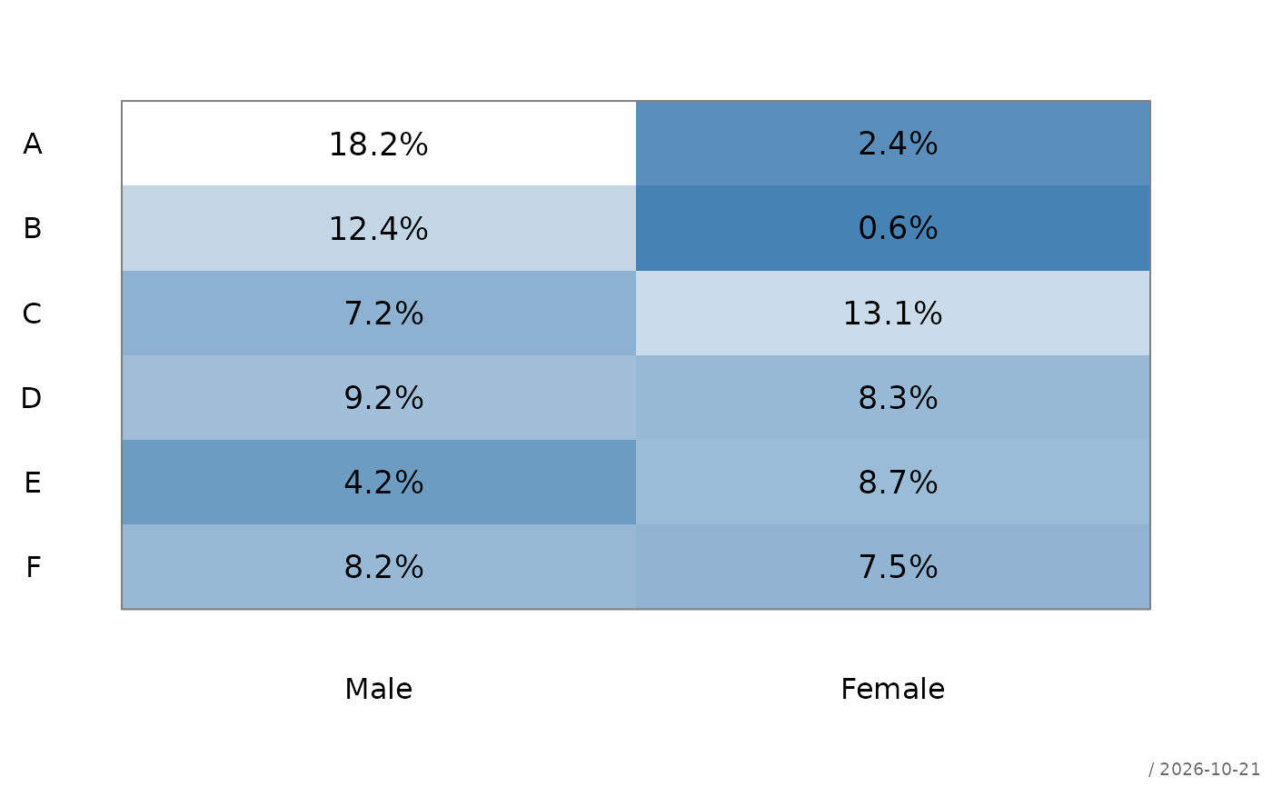
# applicants by department and gender
tab <- margin.table(UCBAdmissions, c(3, 2))
plotHeatmap(tab,
scale = "prop",
text = TRUE)
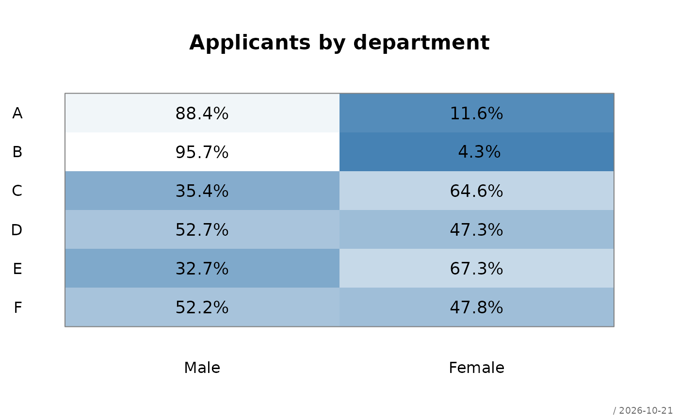
 # share of the genders within the departments
plotHeatmap(tab,
scale = "row",
text = TRUE,
main = "Applicants by department")
# share of the genders within the departments
plotHeatmap(tab,
scale = "row",
text = TRUE,
main = "Applicants by department")