Draws a bubble plot where the position is given by x and y,
and the size of each bubble is proportional to area.
Usage
# Default S3 method
plotBubble(
  x,
  y,
  area,
  main = "",
  xlab = "",
  ylab = "",
  xlim = NULL,
  ylim = NULL,
  add = FALSE,
  col = NA,
  border = NULL,
  cex = 1,
  grid = NA,
  na.rm = FALSE,
  stamp = .useTheme,
  ...
)

# S3 method for class 'formula'
plotBubble(
  formula,
  data = NULL,
  subset,
  na.action = na.omit,
  main = "",
  xlab = "",
  ylab = "",
  xlim = NULL,
  ylim = NULL,
  add = FALSE,
  col = NA,
  border = NULL,
  cex = 1,
  grid = NA,
  ...
)
Arguments
- x
numeric vector of x positions.
- y
numeric vector of y positions.
- area
numeric vector controlling bubble sizes (interpreted as area).
- main, xlab, ylab
plot labels.
- xlim, ylim
axis limits.
- add
logical; if
TRUE, adds to an existing plot.- col
fill color(s) of the bubbles.
- border
border color(s) of the bubbles.
- cex
scaling factor applied to bubble areas.
- grid
logical,
NA, or list controlling background grid.- na.rm
logical; remove missing values.
- stamp
controls the corner stamp.
.useTheme(default) resolves togetTheme()$stamp.TRUE/FALSE/NULL, a string, or a named list forstamp().- ...
additional graphical parameters passed to
par().- formula
A formula of the form
y ~ x | area.- data
optional data frame.
- subset
optional subset expression.
- na.action
function to handle missing values.
Details
The function supports both a default interface and a formula interface
of the form y ~ x | area.
Bubble sizes are interpreted as areas and internally converted to radii via \(r = \sqrt{area / \pi}\). Aspect ratio is corrected to ensure visually accurate circles.
Graphical elements such as grids are controlled via the unified plot
design system using bedrock::callIf() and .theme().
Examples
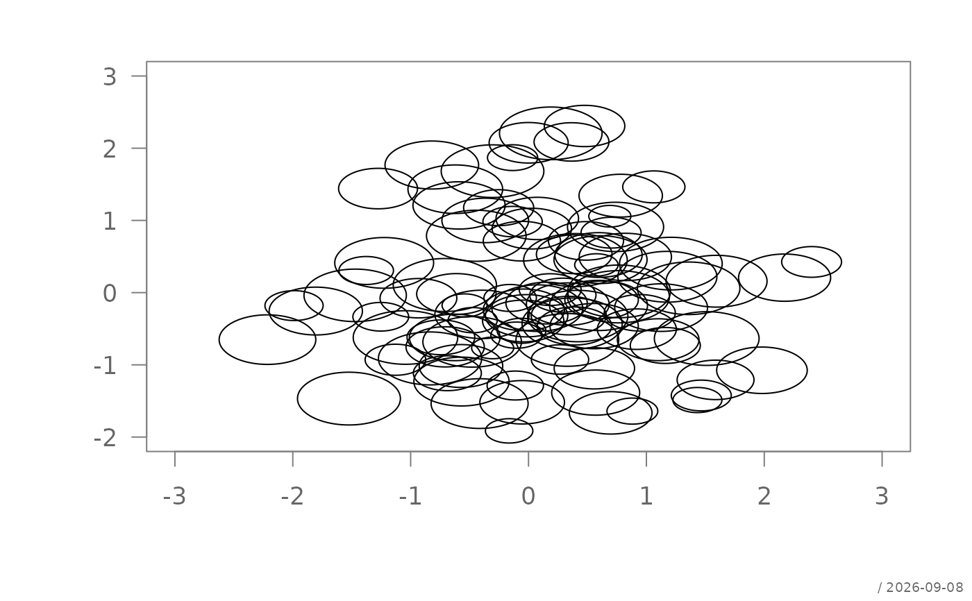
set.seed(1)
x <- rnorm(100)
y <- rnorm(100)
a <- runif(100, 1, 10)
plotBubble(x, y, a)
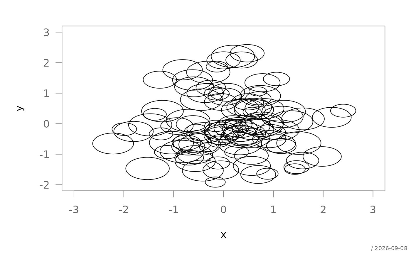
 df <- data.frame(x = x, y = y, a = a)
plotBubble(y ~ x | a, data = df)
df <- data.frame(x = x, y = y, a = a)
plotBubble(y ~ x | a, data = df)
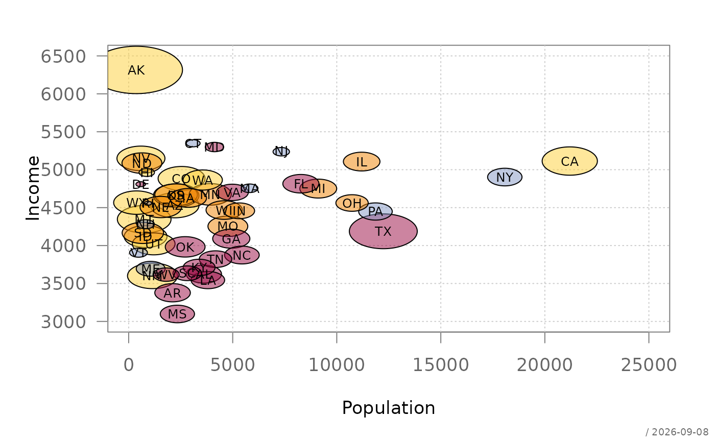
 US <- data.frame(state.x77, State=state.name,
Region=state.region, Abb=state.abb)
plotBubble(Income ~ Population | Area ,
data=US,
grid=TRUE, col=addOpacity(pal("helsana")[US$Region]), cex=1.2 )
text(Income ~ Population, US, labels=US$Abb, cex=0.8)
US <- data.frame(state.x77, State=state.name,
Region=state.region, Abb=state.abb)
plotBubble(Income ~ Population | Area ,
data=US,
grid=TRUE, col=addOpacity(pal("helsana")[US$Region]), cex=1.2 )
text(Income ~ Population, US, labels=US$Abb, cex=0.8)