Cleveland's Dot Plots
PlotDot.RdDraw a Cleveland dot plot. This is an extended version of dotchart with an added option for error bars, an add argument and several more options. PlotCI() is a small helpfunction to facilitate ci-plots of several models.
PlotDot(x, labels = NULL, groups = NULL, gdata = NULL,
        cex = par("cex"), pch = 21, gpch = 21, bg = par("bg"),
        color = par("fg"), gcolor = par("fg"), lcolor = "gray", lblcolor = par("fg"),
        xlim = NULL, main = NULL, xlab = NULL, ylab = NULL,
        xaxt = NULL, yaxt = NULL, add = FALSE, args.errbars = NULL,
        cex.axis = par("cex.axis"), cex.pch = 1.2, cex.gpch = 1.2,
        gshift = 2, automar = TRUE, ...)


PlotDotCI(..., grp = 1, cex = par("cex"),
         pch = 21, gpch = 21, bg = par("bg"), color = par("fg"), gcolor = par("fg"),
         lcolor = "gray", lblcolor = par("fg"), xlim = NULL, main = NULL,
         xlab = NULL, ylab = NULL, xaxt = NULL, yaxt = NULL,
         cex.axis = par("cex.axis"), cex.pch = 1.2, cex.gpch = 1.2,
         gshift = 2, automar = TRUE)
Arguments
- x
either a vector or matrix of numeric values (
NAs are allowed). Ifxis a matrix the overall plot consists of juxtaposed dotplots for each row. Inputs which satisfyis.numeric(x)but notis.vector(x) || is.matrix(x)are coerced byas.numeric, with a warning.- labels
a vector of labels for each point. For vectors the default is to use
names(x)and for matrices the row labelsdimnames(x)[[1]].- groups
an optional factor indicating how the elements of
xare grouped. Ifxis a matrix,groupswill default to the columns ofx.- gdata
data values for the groups. This is typically a summary such as the median or mean of each group.
- cex
the character size to be used. Setting
cexto a value smaller than one can be a useful way of avoiding label overlap. Unlike many other graphics functions, this sets the actual size, not a multiple ofpar("cex").- pch
the plotting character or symbol to be used. Default is 21.
- gpch
the plotting character or symbol to be used for group values.
- bg
the background color of plotting characters or symbols to be used; use
par(bg= *)to set the background color of the whole plot.- color
the color(s) to be used for points and labels.
- gcolor
the single color to be used for group labels and values.
- lcolor
the color(s) to be used for the horizontal lines.
- lblcolor
the color(s) to be used for labels.
- xlim
horizontal range for the plot, see
plot.window, e.g.- main
overall title for the plot, see
title.- xlab, ylab
axis annotations as in
title.- xaxt
a character which specifies the x axis type. Specifying
"n"suppresses plotting of the axis.- yaxt
a character which specifies the y axis type. Specifying
"n"suppresses plotting of the axis.- add
logical specifying if bars should be added to an already existing plot; defaults to
FALSE.- args.errbars
optional arguments for adding error bars. All arguments for
ErrBarscan be supplied. If left toNULL(default), no error bars will be plotted.- cex.axis
The magnification to be used for axis annotation relative to the current setting of cex.
- cex.pch
The magnification to be used for plot symbols relative to the current setting of cex.
- cex.gpch
The magnification to be used for group symbols relative to the current setting of cex.
- gshift
the number of characters, for which the grouplabels should be shift to the left compared to the sublabels.
- automar
logical (default
TRUE), defining if the left margin should be set according to the width of the given labels, resp. grouplabels. If set toFALSEthe margins are taken frompar("mar").- ...
graphical parameters can also be specified as arguments.
- grp
an integer, defining if the the coefficients should be grouped along the first or the second dimension (default is 1).
Details
Dot plots are a reasonable substitute for bar plots. This function is invoked to produce dotplots as described in Cleveland (1985).
For PlotDotCI() the dots are a list of matrices with 3 columns, whereas the first is the coefficent, the second the lower and the third the upper end of the confidence interval.
Value
Return the y-values used for plotting.
See also
dotchart, PlotDotCI
References
Becker, R. A., Chambers, J. M. and Wilks, A. R. (1988) The New S Language. Wadsworth & Brooks/Cole.
Cleveland, W. S. (1985) The Elements of Graphing Data. Monterey, CA: Wadsworth.
Murrell, P. (2005) R Graphics. Chapman & Hall/CRC Press.
Examples
PlotDot(VADeaths, main = "Death Rates in Virginia - 1940")
 op <- par(xaxs = "i") # 0 -- 100%
PlotDot(t(VADeaths), xlim = c(0,100),
main = "Death Rates in Virginia - 1940")
op <- par(xaxs = "i") # 0 -- 100%
PlotDot(t(VADeaths), xlim = c(0,100),
main = "Death Rates in Virginia - 1940")
 par(op)
# add some error bars
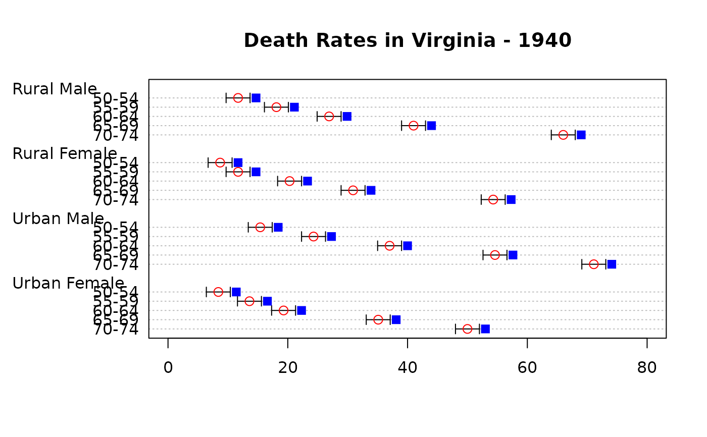
PlotDot(VADeaths, main="Death Rates in Virginia - 1940", col="red", pch=21,
args.errbars = list(from=VADeaths-2, to=VADeaths+2, mid=VADeaths,
cex=1.4))
# add some other values
PlotDot(VADeaths+3, pch=15, col="blue", add=TRUE)
par(op)
# add some error bars
PlotDot(VADeaths, main="Death Rates in Virginia - 1940", col="red", pch=21,
args.errbars = list(from=VADeaths-2, to=VADeaths+2, mid=VADeaths,
cex=1.4))
# add some other values
PlotDot(VADeaths+3, pch=15, col="blue", add=TRUE)
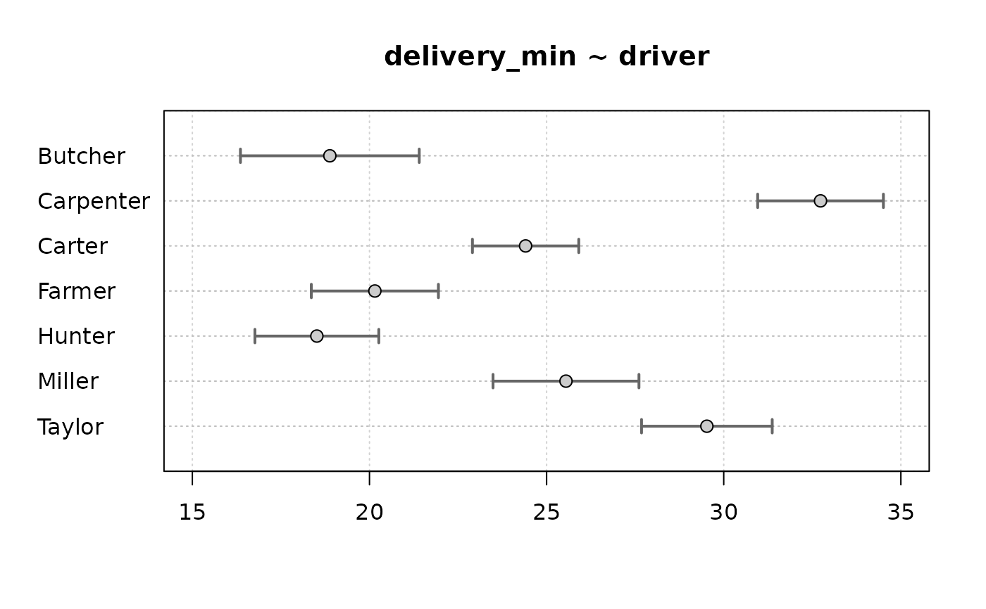
 # same as PlotDotCI
xci <- do.call(rbind, tapply( d.pizza$delivery_min, d.pizza$driver,
MeanCI, conf.level=0.99, na.rm=TRUE))
PlotDot(xci[,1], main="delivery_min ~ driver", pch=21, bg="grey80", col="black",
args.errbars = list(from=xci[,2], to=xci[,3], mid=xci[,1], lwd=2, col="grey40", cex=1.5),
xlim=c(15,35), panel.before=grid())
#> Warning: "panel.before" is not a graphical parameter
#> Warning: "panel.before" is not a graphical parameter
# same as PlotDotCI
xci <- do.call(rbind, tapply( d.pizza$delivery_min, d.pizza$driver,
MeanCI, conf.level=0.99, na.rm=TRUE))
PlotDot(xci[,1], main="delivery_min ~ driver", pch=21, bg="grey80", col="black",
args.errbars = list(from=xci[,2], to=xci[,3], mid=xci[,1], lwd=2, col="grey40", cex=1.5),
xlim=c(15,35), panel.before=grid())
#> Warning: "panel.before" is not a graphical parameter
#> Warning: "panel.before" is not a graphical parameter
 # with group data
x <- with(d.pizza, tapply(temperature, list(area, driver), mean, na.rm=TRUE))
PlotDot(x, gdata = tapply(d.pizza$temperature, d.pizza$driver, mean, na.rm=TRUE),
gpch = 15)
# with group data
x <- with(d.pizza, tapply(temperature, list(area, driver), mean, na.rm=TRUE))
PlotDot(x, gdata = tapply(d.pizza$temperature, d.pizza$driver, mean, na.rm=TRUE),
gpch = 15)
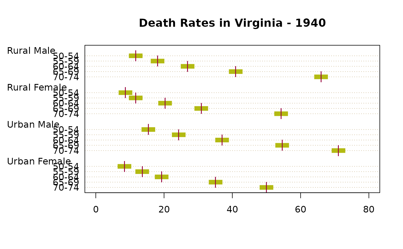
 # special format
par(lend=1)
PlotDot(VADeaths, main="Death Rates in Virginia - 1940", pch="|",
lcolor = DescTools::hecru, col=DescTools::hred,
args.errbars = list(from=VADeaths-2, to=VADeaths+2, mid=VADeaths,
cex=1.3, lwd=8, code=0, col=DescTools::hgreen))
# special format
par(lend=1)
PlotDot(VADeaths, main="Death Rates in Virginia - 1940", pch="|",
lcolor = DescTools::hecru, col=DescTools::hred,
args.errbars = list(from=VADeaths-2, to=VADeaths+2, mid=VADeaths,
cex=1.3, lwd=8, code=0, col=DescTools::hgreen))
 # Error bars for binomial confidence intervals
tab <- table(d.pizza$driver, d.pizza$wine_delivered)
xci <- SetNames(BinomCI(tab[,1], rowSums(tab)), rownames=rownames(tab))
PlotDot(xci[,1], main="wine delivered ~ driver ", xlim=c(0,1),
args.errbars=list(from=xci[,-1], mid=xci[,1], pch=21))
# Error bars for binomial confidence intervals
tab <- table(d.pizza$driver, d.pizza$wine_delivered)
xci <- SetNames(BinomCI(tab[,1], rowSums(tab)), rownames=rownames(tab))
PlotDot(xci[,1], main="wine delivered ~ driver ", xlim=c(0,1),
args.errbars=list(from=xci[,-1], mid=xci[,1], pch=21))
 # Error bars for confidence intervals for means
xci <- do.call(rbind, tapply(d.pizza$delivery_min, d.pizza$driver,
MeanCI, conf.level=0.99, na.rm=TRUE))
PlotDot(xci[, 1], main="delivery_min ~ driver", args.errbars=list(from=xci))
# Error bars for confidence intervals for means
xci <- do.call(rbind, tapply(d.pizza$delivery_min, d.pizza$driver,
MeanCI, conf.level=0.99, na.rm=TRUE))
PlotDot(xci[, 1], main="delivery_min ~ driver", args.errbars=list(from=xci))
 # Setting the colours
# define some error bars first
lci <- sweep(x = VADeaths, MARGIN = 2, FUN = "-", 1:4)
uci <- sweep(x = VADeaths, MARGIN = 1, FUN = "+", 1:5)
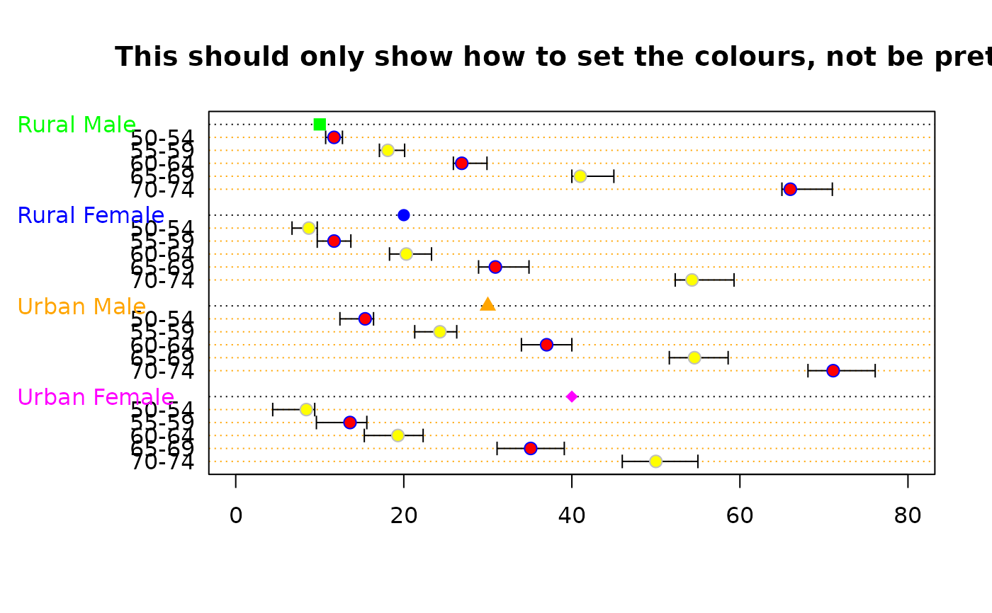
PlotDot(VADeaths, main="This should only show how to set the colours, not be pretty",
pch=21, col=c("blue","grey"), bg=c("red", "yellow"),
gcolor = c("green", "blue", "orange", "magenta"), gdata=c(10,20,30,40),
gpch = c(15:18), lcolor = "orange",
args.errbars = list(from=lci, to=uci, mid=VADeaths, cex=1.4))
# Setting the colours
# define some error bars first
lci <- sweep(x = VADeaths, MARGIN = 2, FUN = "-", 1:4)
uci <- sweep(x = VADeaths, MARGIN = 1, FUN = "+", 1:5)
PlotDot(VADeaths, main="This should only show how to set the colours, not be pretty",
pch=21, col=c("blue","grey"), bg=c("red", "yellow"),
gcolor = c("green", "blue", "orange", "magenta"), gdata=c(10,20,30,40),
gpch = c(15:18), lcolor = "orange",
args.errbars = list(from=lci, to=uci, mid=VADeaths, cex=1.4))