Add a Linear Regression Line
lines.lm.RdAdd a linear regression line to an existing plot. The function first calculates the prediction of a lm object for a reasonable amount of points, then adds the line to the plot and inserts a polygon with the confidence and, if required, the prediction intervals.
In addition to abline the function will also display polynomial models.
Arguments
- x
linear model object as result from lm(y~x).
- col
linecolor of the line. Default is the color returned by
Pal()[1].- lwd
line width of the line.
- lty
line type of the line.
- type
character indicating the type of plotting; actually any of the
typesas inplot.default. Type of plot, defaults to"l".- n
number of points used for plotting the fit.
- conf.level
confidence level for the confidence interval. Set this to
NA, if no confidence band should be plotted. Default is0.95.- args.cband
list of arguments for the confidence band, such as color or border (see
DrawBand).- pred.level
confidence level for the prediction interval. Set this to NA, if no prediction band should be plotted. Default is
0.95.- args.pband
list of arguments for the prediction band, such as color or border (see
DrawBand).- xpred
a numeric vector
c(from, to), if the x limits can't be defined based on available data, xpred can be used to provide the range where the line and especially the confidence intervals should be plotted.- ...
further arguments are not used specifically.
Details
It's sometimes illuminating to plot a regression line with its prediction, resp. confidence intervals over an existing scatterplot. This only makes sense, if just a simple linear model explaining a target variable by (a function of) one single predictor is to be visualized.
Value
nothing
See also
Examples
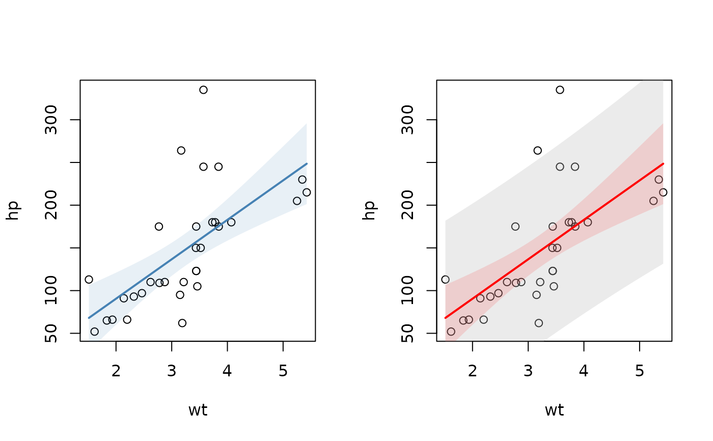
opar <- par(mfrow=c(1,2))
plot(hp ~ wt, mtcars)
lines(lm(hp ~ wt, mtcars), col="steelblue")
# add the prediction intervals in different color
plot(hp ~ wt, mtcars)
r.lm <- lm(hp ~ wt, mtcars)
lines(r.lm, col="red", pred.level=0.95, args.pband=list(col=SetAlpha("grey",0.3)) )
 # works with transformations too
plot(dist ~ sqrt(speed), cars)
lines(lm(dist ~ sqrt(speed), cars), col=DescTools::hred)
plot(dist ~ log(speed), cars)
lines(lm(dist ~ log(speed), cars), col=DescTools::hred)
# works with transformations too
plot(dist ~ sqrt(speed), cars)
lines(lm(dist ~ sqrt(speed), cars), col=DescTools::hred)
plot(dist ~ log(speed), cars)
lines(lm(dist ~ log(speed), cars), col=DescTools::hred)
 # and with more specific variables based on only one predictor
plot(dist ~ speed, cars)
lines(lm(dist ~ poly(speed, degree=2), cars), col=DescTools::hred)
par(opar)
# and with more specific variables based on only one predictor
plot(dist ~ speed, cars)
lines(lm(dist ~ poly(speed, degree=2), cars), col=DescTools::hred)
par(opar)